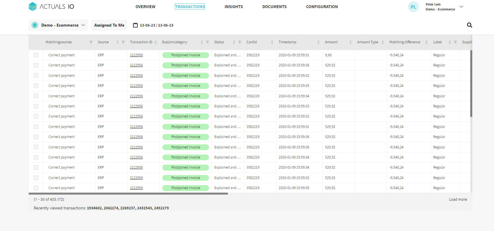
The transactions page shows an overview of all transactions that are either explained or unmatched. The page allows extensive filtering of the values in the different parameters and matching related properties.

The transactions page can be accessed directly or by following the link on the overview page (this directly filters the transactions on a specific matching package and source and possible a segment, based on the filters of the overview page). Filtering is possible for a selected group of columns, but not all of them. The column headers can be clicked to filter all rows on containing specific values for the column. Initially 30 transactions are loaded, when scrolling or clicking the Load more link at the bottom right results in 30 additional transactions being loaded. Values in the transactionid column can be clicked to view the transaction details for that specific value. The top right corner of the transactions page contains a search field, which can be used to search for a specific transaction. The drop down menu allows searching in specific properties for a value, by default all the listed properties are queried for the provided value. The order and names of the columns can be changed as well as which columns are clickable and the properties that can be searched for. Feel free to reach out to support@actuals.io to create the configuration you want.
Transaction details
The transaction details for a search value show the details for all transactions that meet the search criteria. On the left hand side the matching details per matching package are shown. The details consist of the number of rows and the total amount for each of the sources in the matching package. With color the matching status is shown
- Red : Unmatched
- Orange : Explained
- Green : Matched and not processed
Note that status not relevant is never shown as sources that are not relevant are not counted in the total for a matching package.

Example
Given the following transactions
source | transactionid | amount | balancedifference |
A | 123 | 60 | -20 |
B | 123 | 80 | -20 |
C | 123 | 40 | 10 |
C | 123 | 40 | 10 |
And let’s assume there are two matching packages: matching package between source A and B and a second between source B and C. Then the matching details for transaction 123 will show
- 60/1 - 80/1 for the first matching package indicated with red as the amounts are not equal
- 80/1 - 80/2 for the second matching package indicated with green as the amounts are equal
For explained transactions, it is possible to hover over the matching details to also see the explanation category. Apart from the matching details on the left hand side, the total number of transactions and the total amount per source is shown on the right hand side. A matching package can be clicked to filter this list on only the sources that are relevant to that specific matching package. The totals per source can be expended to show the individual transactions for that source. The columns shown here are similar to the columns shown on the transactions overview page. Each transaction also contains the eye icon to see the source data that was used to process the transaction. The transaction details also contain a Copy link button. This button generates an encrypted link to this transaction details view that can be shared with other users of the platform. It can only be opened by users which have access to the customer environment.
Explaining
The transactions page allows individual transactions to be explained. This can be achieved by checking the boxes on the rows on the transactions overview page or by selecting a matching package on the transaction details for the Matching sources dropdown.

Specifically for explaining unmatched transactions, the following statusses are possible (and can be filtered on)
- Unmatched, no explanation (grey)
- Explained, waiting for approval (brown)
- Explained and approved (green)
- Rejected (red)
Initially transactions are unmatched. The second step is to explain these transaction by providing a category, assignee, description and action. The most important property is the category as this is one of the segments on the overview page to report the transactions on. When this initial explanation is provided, the status is changed to Explained, waiting for approval. The transaction is not explained yet, but requires an approval. The Actuals Platform is set such that different user roles can add an explanation (Finance user) and approve it (Finance approver). This results in a 4 eyes principle before the explanations are final. The approver can choose to approve the transaction or rejected it. Selecting the transactions to take this action on is similar to selecting the initial transactions to be explained. Explained and approved transactions cannot be changed, for Rejected transactions a new explanation can be provided.
Other functionality
The transaction page allows filters on many different columns, typically these columns can also be clicked to sort the results on. The top of the page contains a date picker, similar to the data picker on the overview page. The Assigned to me button allow users to quickly filter all transactions for which an explanation is provided and they are the asignee. The bottom of the transactions page contains a list of the 5 most recently viewed transactions.
